Foundation for Peaceful Communities: A Graphic Design Case Study
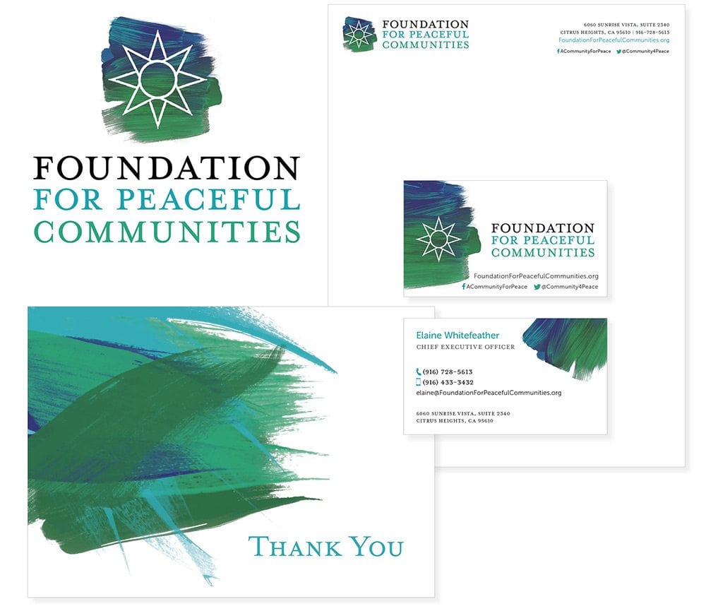
We were honored to create the visual identity for the Foundation for Peaceful Communities. The goal of creating the brand identity was to convey a feeling of hope and community.
The Foundation’s main goals are the prevention of domestic violence, homelessness, and trafficking. Each being treated as a social justice issue.
The brand identity was meant to evoke a feeling of hope and warmth. Making the interaction with the brand an engaging, friendly experience.
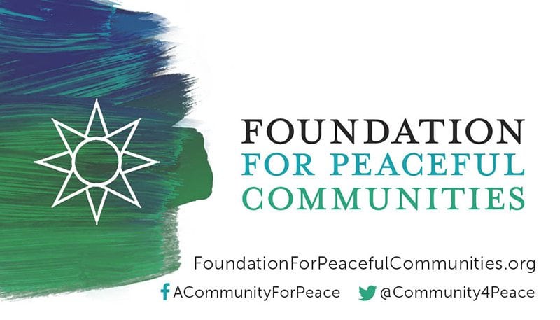

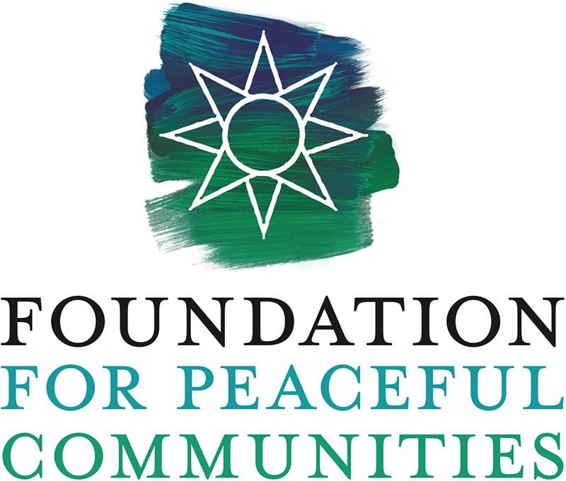

The logo was designed to speak to the idea of humanity, since the etymology of the word HUMAN is HU = divine, MAN = mortal; hence the spirit of humanity.
After a few drafts, the new logo for the Foundation for Peaceful Communities emerged. It conveyed a natural, organic feeling created by a brushstroke behind a symbol of a star.
The eight pointed star is a symbol of hope and guidance. It represents the four cardinal points of north, south, east and west. It also represents their connection to the outermost points on the horizon where the sun passes through the year; the solstice and equinox points. The other points lead to the summer solstice where the sun path would be at its farthest north when the days are longest. A time of renewal and opportunity and trust in what’s to come.
We used several, beautifully combined shades of green and blue to create depth in the brush strokes and we made sure the symbol of the star also had an organic feel to it. The use of a well-crafted serif font was a natural consequence of this choices. We then applied the same principles through all of the collateral to create a consistent branding identity that stood out.
