Project Overview
In a saturated market, CAL FIRE Benevolent Foundation came to Uptown Studios knowing they wanted to increase their brand awareness and refresh their look to help ensure they didn’t get lost amongst their competition. Competing for volunteers and donations, CAL FIRE Benevolent Foundation needed to find a way to create better brand awareness. An established organization, they wanted to be strategic about the implementation of a new logo and work with a firm that knew how to do just that.
Background
In addition to many other organizations like Cal Fire and Firefighter Benevolent Fund, CAL FIRE Benevolent Foundation provides funds for immediate, life-sustaining assistance to firefighters and their families who have suffered debilitating injury or loss of life. CAL FIRE Benevolent Foundation has a rich history, but because of the name confusion, Uptown Studios identified that a logo refresh would help give CAL FIRE Benevolent Foundation the bump, and clarity, they were looking for.
Discovery
To begin the design process, the Design Team developed a Creative Brief that identified and built empathy with the CAL FIRE Benevolent Foundation’s target audience. Taking into account the existing name confusion, it was essential to also identify what logo elements would better differentiate CAL FIRE Benevolent Foundation from their competition. Building empathy with the target audience and their competition allowed the Design Team to begin creating with a strong, informed foundation.
Design
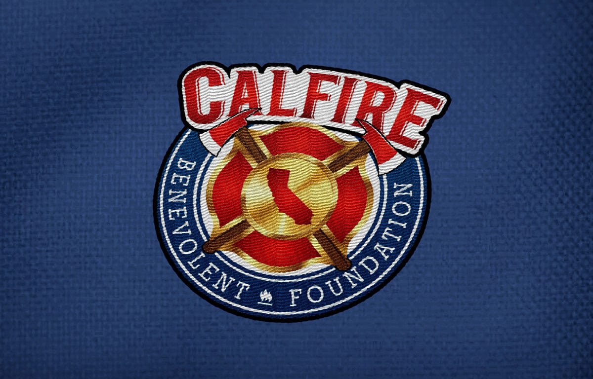
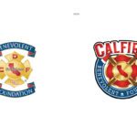
Taking into account the existing brand equity, the design team did a “large-scale refresh,” meaning a distinct image change but not totally new direction, to the CAL FIRE Benevolent Foundation logo. The team first decided on which elements to keep. The Maltese cross was the most visually symbolic mark of CAL FIRE Benevolent Foundation’s industry, so that needed to stay. Using that as a foundation, the original banners evolved into an emblem to create better readability and logo mark reproduction ease. The original colors were shifted to be more vibrant and modern. And lastly, to help distinguish CAL FIRE Benevolent Foundation from their competition but also position them deep within the industry they serve, the iconic fireman’s ax, or Pulaski ax, was added in conjunction with the Maltese cross.
Results
- Large scale logo refresh with a slightly altered color palette
- Higher brand equity and clarity
- A new logo with good reproduction potential across any medium

