Project Overview
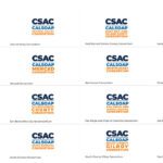
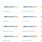
In 2019, the California Student Aid Commission (CSAC) partnered with Uptown Studios to conduct an in-depth Human-Centered Design study to refresh their logo and communications materials. Using the Human-Centered Design findings, the Uptown Studios Design Team refreshed the CSAC logo and all corresponding child brands for a grand total of 25 different logo suites.
BACKGROUND
CSAC is the principal state agency responsible for administering financial aid programs for students attending public and private universities, colleges, and vocational schools in California. CSAC has never wavered from its central mission to make education beyond high school financially accessible to all Californians. CSAC serves as a resource for policymakers and the public on college affordability and financing issues, and advocates for policy changes to eliminate cost as a barrier to any qualified California student pursuing higher education.
DISCOVERY
CSAC owns several “brands” or programs that make up the organization. CSAC is the parent brand to Cal Grants, California Chafee Grant for Foster Youth, Middle-Class Scholarship Program, California Student Opportunity, and Access Program, Child Savings Account Grant Program, Every Kid Counts, and the Cash for College program. The expansion of the organization is best demonstrated through the increase of awarded amounts of the organization’s biggest grant program, Cal Grant. Keeping this structure in mind, the Uptown Studios Design team had to not only create a refreshed logo that better symbolized CSAC’s mission and vision, but also create a system of organization to allow for future program logo creations that fit into the new overall refreshed brand.
DESIGN
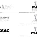
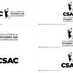
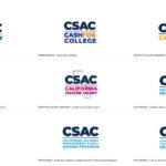
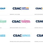
The larger CSAC logo concept derived from the journey that students take when they follow their dreams and are able to achieve them with the help of CSAC. The journey is represented by the graduate with their mortarboard looking forward to their future. The state is shown supporting the student in the background; representing their pride and diversity in California. The androgynous student looking into the future, jumping for joy, and throwing their cap is a nod to the original CSAC logo. The colors are hopeful, professional, modern, and inspiring while holding equity for the current branding. They provide the same feeling and energy a student gets when they are able to accomplish their dreams with CSAC by their side. The create a better organization for all CSAC assets, the Uptown Studios Design team created four logo categories: outreach, workshops, grants and scholarships, and programs. Each category has its own corresponding logos, using the same lock-up without the androgynous graduate. For CalSOAP, each county has its own logo with all compositions in a similar lockup.
RESULTS
- Refreshed. modern CSAC parent logos
- Corresponding 24 child logos for each program, outreach, workshop, grant, and scholarship
- Download the CSAC style guide now
