Objective
The biggest challenge with this project was the fact that the organization itself was so nuanced. Center for Land Based Learning offers so many different kinds of programs; some for adults, some for youth, some are training programs, some are community focused on sustainability. They also have other sections involved, like a mobile’s farmers market and alumni network.
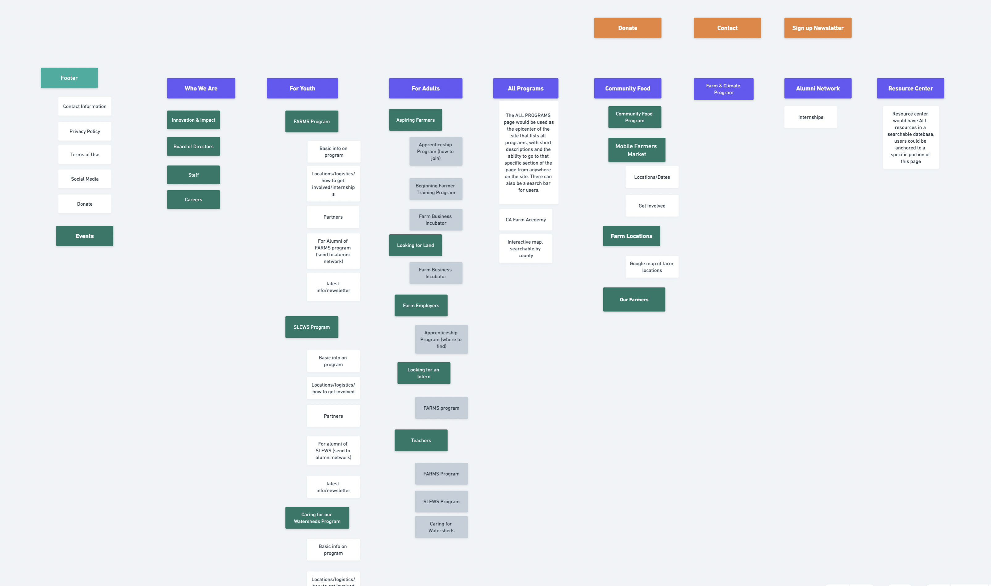
When there is an organization that is this layered the biggest challenge is creating a sitemap and information architecture that can serve every different demographic coming to the site. With UX best practices in mind, we got to work on a sitemap that can serve every user.
Strategy & Approach
For websites of this nature, we create them from the inside out. Meaning before we even get into a design phase we have to figure out what the navigation and architecture will look like. And in the case of this project, before we even did that, we used a UX process called “card sorting” in which we break down demographics and then identify what each of them would be needing to find on the website. In card sorting, the idea is to ensure each end user is getting served what they need and in the appropriate space. For example, “for adults” might refer to adults looking for adult programs, but could also imply items for teachers. It’s a cross pollination of information that has to be carefully outlined in order to create a sitemap that works. Our approach was to use card sorting first, then site mapping and information architecture, before then designing and developing the website.
Implementation
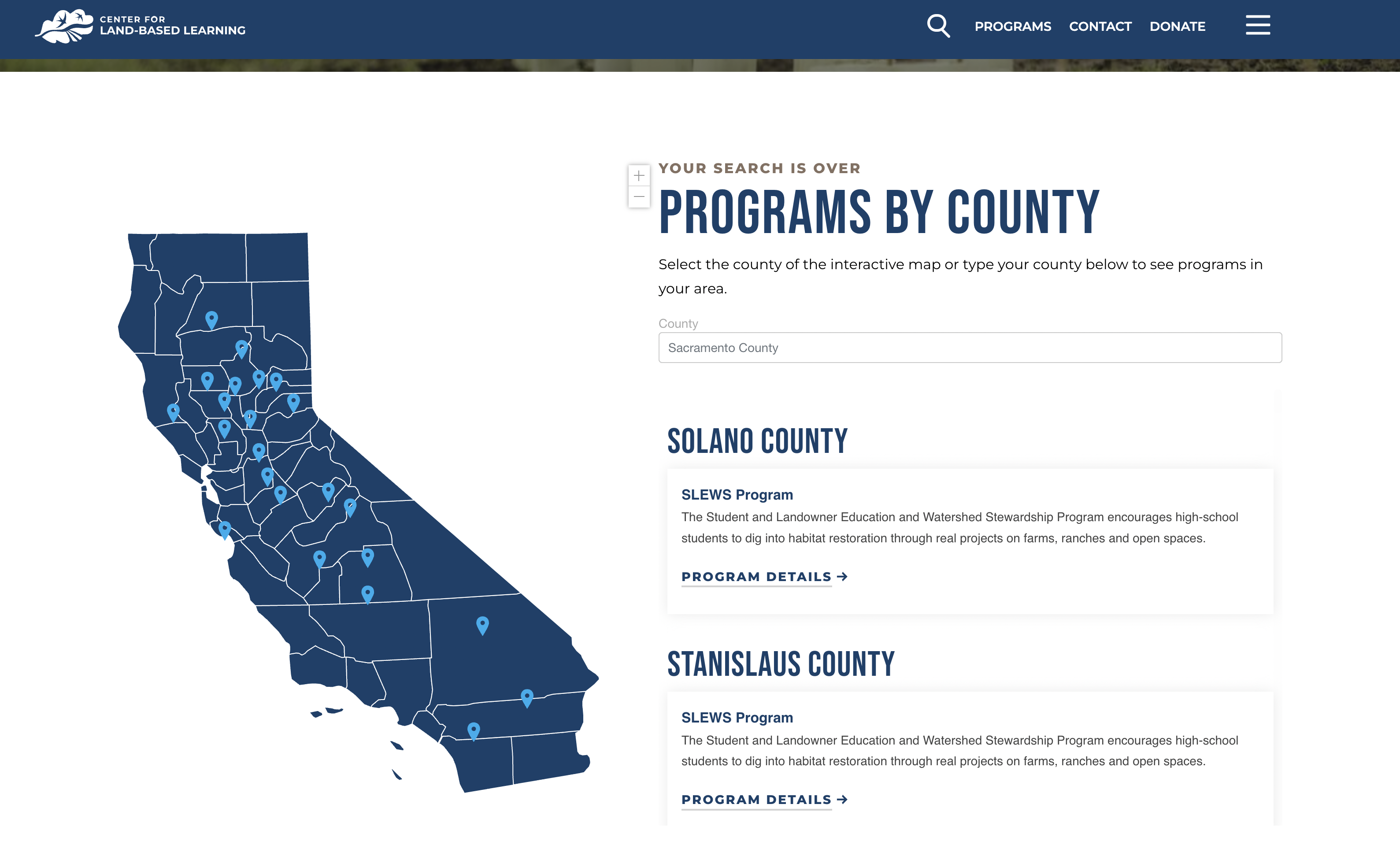
We created large art boards for card sorting and worked directly with the client to figure out the needs of their users. We worked with specialized software to sort through the content and propose a new structure that was user-friendly and easy to navigate. We used the interactive map as the epicenter of the website, allowing users to go to an All Programs page and enter their zip code that would then bring up programs in their area. With this at the heart of the site, we built the sitemap around that. We spent 6 months on sitemapping before it was finally ready for design.
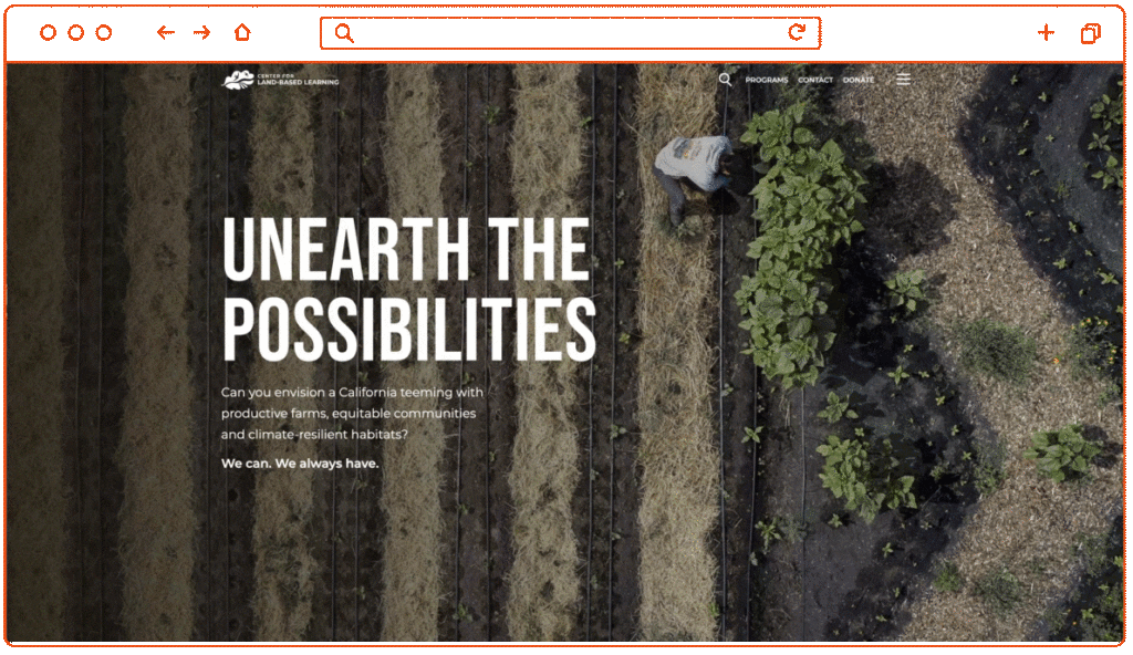
For the design, our creative team refreshed the logo by offering something cleaner, sleeker and more in line with the brand overall. For the website design, we wanted to create something approachable but modern, and not solely based on the idea of “farms and agriculture.” In the end, the engaging imagery, striking messaging and UX developed layout made it one of our most beautiful websites. We used scrolling, animated words to show movement and character, and gave the map a branded and thoughtful look.
In development we had to organize hundreds of pages of data, and categorize things properly so that it made sense within the massive sitemap. We opted for a “hamburger menu” rather than a top navigation, so that all the categories could be expanded easily without overwhelming the user. The interactive map filters by zip code perfectly, and the back end boasts every up-to-date feature and plugin that WordPress has to offer. After about a year of hard work, we took the site live and continue to host and manage it.
Conclusion
At its heart, the Center for Land Based Learning was a UX project. We would not have been able to create a design that worked and developed a responsive, speedy website without first figuring out the complexities of the primary and secondary navigation. We took our time to do it right rather than do it fast, and in the end the website is one that we’re very proud of. We got word from the client after about a month post-launch saying their engagement was up, their donation rate was up, and they have people signing up for programs via their website more than ever before. With an involved client and a talented team, we were able to unearth the possibilities.