Why Your Website Needs to Fit in Your Pocket

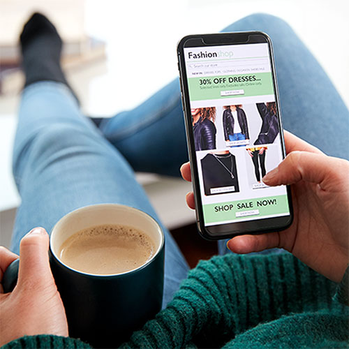
A strong mobile presence isn’t optional anymore, it’s essential to how people engage, support, and trust your brand. Your website needs to look just as inspiring and accessible on a palm-sized screen as it does on a desktop. Why? Because thumbs rule the internet.
Your audience isn’t always sitting at a desk. They’re walking their dog, riding the train, waiting for their next meal, or scrolling quietly during a busy day. Almost all of this happens on mobile devices. Your website needs to meet your viewer where they are, on the smallest screen, while making an impact. In short, if your site isn’t built for phones, it’s built to be overlooked.
Attention spans are short, screens are smaller, and expectations are higher than ever. Visitors won’t wait for a slow site to load or strain to read tiny text. They’ll simply bounce and find another brand that gets it.
If your site is still stuck in its desktop glory days, it’s time to evolve. Your digital presence needs to be as mobile as the audience you’re striving to serve. If your website isn’t optimized for mobile, it’s like hanging a digital “Closed” sign on your storefront for over half of your potential visitors.
Google’s Got a Mobile Crush
Google officially uses mobile-first indexing, which means it looks at the mobile version of your site before anything else when deciding where to rank you in their search results. In other words, if your site isn’t mobile-friendly, it’s not just users who are ghosting you…Google is too.
Mobile Design Isn’t Shrinking, It’s Evolving

Mobile design isn’t just about shrinking your desktop site to fit a smaller screen. Mobile design elements to focus on might include: big buttons that are easy to tap, menus that are simple enough to navigate without a manual, readable fonts that don’t require zooming-in, and content that tells your story clearly and quickly. Success stems from fast-loading pages, clear visuals, and intuitive navigation. It’s all about crafting an experience that feels natural and welcoming, just like your mission.
Mobile users are action-takers, shoppers, clickers, and impulse decision-makers. A seamless mobile experience leads directly to more engagement, more conversions, and ultimately, more impact. A site that fits in your pocket helps put more into your mission’s future.
Time for a Mobile Reality Check
Open your website on your phone right now. Scroll through it. Try to make a purchase or get information. Would you stick around?
If the answer is no, don’t worry. We’re here to help.
At Uptown Studios, we transform clunky websites into mobile marvels. Let’s shrink your site (in size) and grow your impact (in results).
Let’s talk mobile websites. Let’s grow your mission.
Uncategorized


