
CSS3: Game Changer
CSS3 has changed the way websites are designed and consumed on phones and desktops. The world of the web has come a long way since its early days of moving GIFs and table based layouts. In the dark days of the internet as a web developer, you were restricted to aligning elements either left, right or center, with little else to work with in terms of layout. You had access to 216 colors and a couple dozen ‘web safe’ fonts (which sounds like more than it actually was). You were driven to use (ugh) tables to achieve any sort of compelling layout. With their limitless rows and cells to fill with graphics and type, tables could be used to placate the deep, wanting need to make content on the web as rich as content in print, with only marginal success.

Then along came Cascading Style Sheets (dun da da duuuun!) to the rescue. In 1996 the W3C introduced CSS, a brand new styling language, and along with it came the beginning of the end of table-based layouts. It allowed for more precise control over and better separation between markup and layout. By applying ID’s and classes to specific elements in your HTML markup you could use CSS’s declaration blocks to control all manner of things, like font size, font weight, width and height (in pixels, percents or points), positioning, background images, margins, padding, and so much more. It now became infinitely easier to achieve compelling, creative layouts on the web. This also enabled developers to create multiple pages that share formatting and reduce complexity and repetition in the structural content. Combine CSS with scripting languages such as JavaScript and and PHP, and things really start to get interesting.
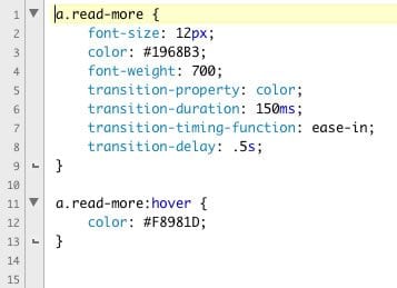
CSS is only getting better. It is currently in its third iteration, otherwise known as CSS3. These days, as long as an end user is using a modern browser (read: NOT Internet Explorer) a web developer can implement some pretty amazing features such as, but not limited to, text transitions, transforms and key frame animations, previously only possible through the use of JavaScript and jQuery. Also, fonts traditionally considered not to be ‘web safe’ can be embedded, taking the burden off the end user to actually have the font on their computer. Other features include opacity, gradients, transparency, multiple background images and rounded corners! These features greatly add to the visual appeal and give the end user a more robust experience. Although totally unnecessary in terms of functionality, they are just plain cool to look at. And ‘just plain cool’ could be a huge reason why someone will choose to spend more time on your website compared to your competitor.
Despite all the amazing things CSS can do, the complex layouts of magazines and other publications is still the things dreams are made of when it comes to the world wide web. That is, until Adobe (who else?) decided that enough is enough and began the holy crusade of bringing desktop publishing into the browsers. Enter, CSS Regions and Exclusions, and they are definitely as awesome as they sound.
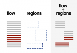
Long has the world of print been able to wrap text around complex objects and flow text seamlessly around pull-quotes and images. CSS Regions and Exclusions would allow web developers the ability to do exactly that. With Regions and Exclusions, web developers and designers will soon have the ability to flow text into, through and around any object.
Note: CSS Regions and Exclusions are still very much a work in progress and are only visible in Google’s Chrome browser. Even then, a bit of nerd magic is required to view CSS Regions and Exclusions in all their splendor.
The World Wide Web is only going to continue to get better. Unfortunately, some of the most innovative and creative things being done on the internet these days in terms of web design and development are not compatible with legacy browsers (*cough* IE *cough*). Which begs the question, Why would you want to view only half of the web? So do yourself and your fellow web developers (who work tirelessly to bring you the best) a favor and upgrade your browser. You’ll be happy you did.
(Fun Fact: Did you know Web Developers rarely come out of their caves during normal human hours? If you come across one in the wild, do not attempt to snap pictures on your Windows Phone or Blackberry, as this will likely startle and enrage it. Modest offerings of Red Bull and cheese pizza will keep these majestic creatures returning for more once every two and half days, which is the average waking cycle of the Webinus Developorus.)
Blog