Design that Inspires
Uptown Studios started in 1992 as a graphic design studio. Great graphic design is at the core of all that we create. We want you to be captivated with the things we design. We want you to touch them, pick them up, read them, be inspired by them, click on the buttons and take action. Everything we do is created to entice you – the user – to do something.
Our graphic designers work to create beautiful designs that make your brand’s identity, messages and marketing materials come to life. We pride ourselves on our innovative logo designs, print ads, brochures, billboards, car wraps and animated graphics that can’t be ignored.
Our in-house graphic designers are with you from start to finish, ensuring that the final product is exactly what you need.
If you can see it, we can do it:
- Infographics
- Marketing materials
- Logos
- Websites
- Business cards
- Brochures
- Newsletters
- Presentations
- Programs
- Postcards
- Posters
- Handbills
- Billboards
- Catalogs
Infographics
If you want to simplify a complicated topic or idea for your audience, you need an infographic. We create infographics that take large amounts of hard to digest data and break them down into easy to manage graphical pieces. These engaging visualizations educate and inform your audience about a complex data and tell a story that is easy to follow.
People online are often just skimming information. High quality infographics can be massively engaging especially for these online readers who are 30 times more likely to read an infographic rather than regular text. It’s important to leverage infographics to share your data and make an impact with online audiences.
Awesome Work
Uptown Studios is passionate about creating easy, fun and popular design that puts your organization, product or service front and center for your audience. We take pride in delivering results that delight and inspire, and it shows in our portfolio of awesome work.
Foundation for Peaceful CommunitiesA Graphic Design Case Study
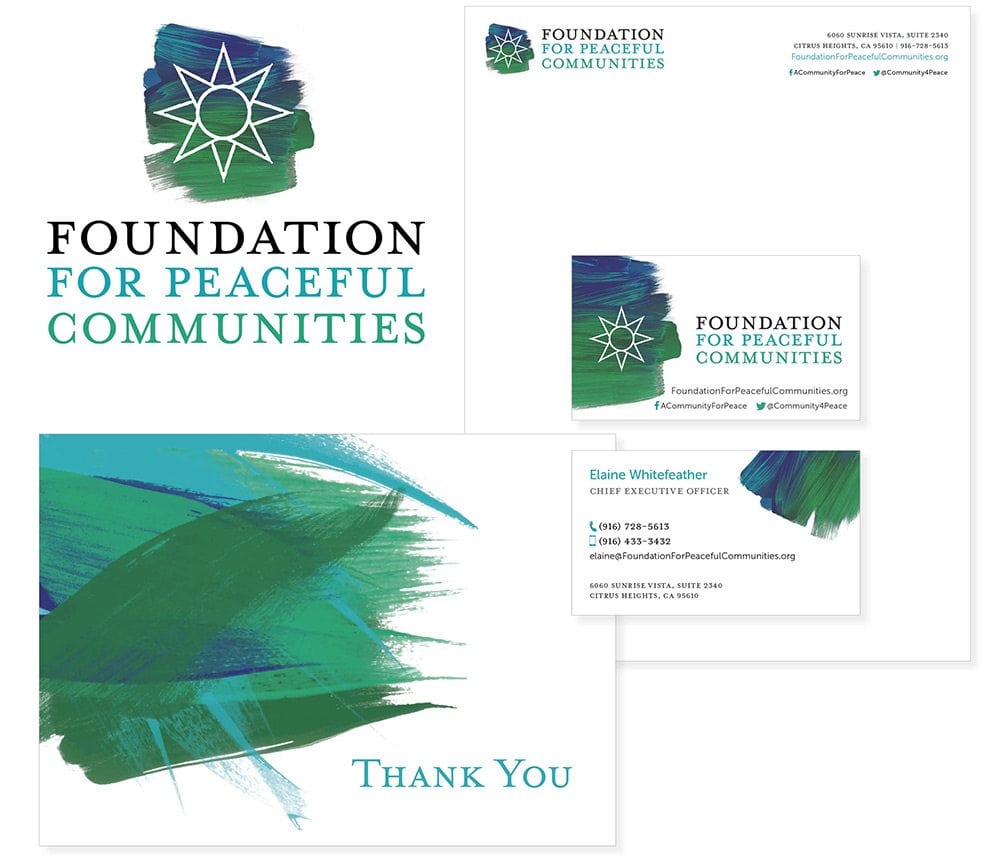
We were asked to create the visual identity for Foundation for Peaceful Communities which we were honored and excited to do. The identity was supposed to convey a feeling of hope and community.
The Foundation’s main goals are prevention of domestic violence, homelessness and trafficking, treated as a social justice issue.
The brand identity was meant to evoke a feeling of hope and warmth and make the interaction with the brand an engaging, friendly experience.
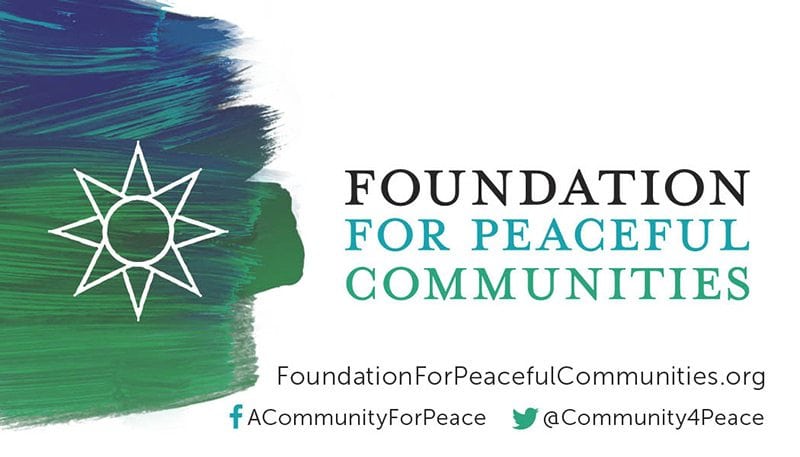


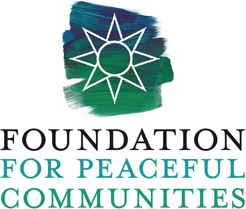

The logo was designed to speak to the idea of humanity, since the etymology of the word HUMAN is HU = divine, MAN = mortal; hence the spirit of humanity.
After a few drafts, the new logo for Foundation for Peaceful Communities emerged. It conveyed a natural, organic feeling created by a brush stroke behind a symbol of a star.
The 8 pointed star is a symbol of hope and guidance. It represents the four cardinal points of north, south, east and west and their connection to the outermost points on the horizon where the sun passes through the year – the solstice and equinox points. The other points lead to the summer solstice where the sun path would be at its farthest north when the days are longest. A time of renewal and opportunity and trust in what’s to come.
We used several, beautifully combined shades of green and blue to create depth in the brush strokes and we made sure the symbol of the star also had an organic feel to it. The use of a well-crafted serif font was a natural consequence of this choices. We then applied the same principles through all of the collateral to create a consistent branding identity that really stands out.
