Project Overview
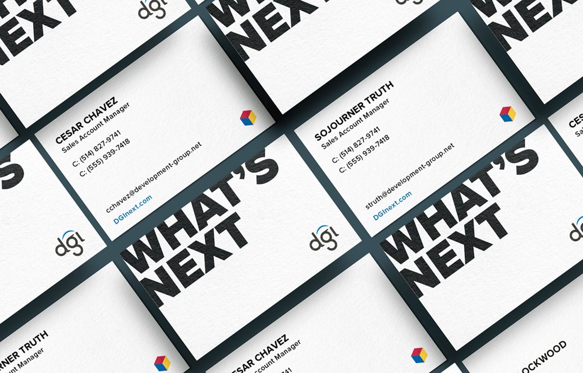
In the summer of 2019, Development Group, Inc (DGI) came to Uptown Studios with a mission: rebrand everything. Looking to launch a new product in tandem with their rebrand, the Uptown Studios Design, Marketing, and Web teams all worked together to create an entirely new online presence for DGI and their flagship product, rubi.
Background
Based out of Redding, California, DGI is changing the way technology is delivered and managed for K-12 schools. Ready to launch a new product, DGI wanted to show the world that they were embarking on a new journey. Making the pursuit of education and innovation a life-long venture, DGI is more than an education technology company: they are at the forefront of a movement committed to serving learners of all ages by making the most essential pieces of education available to all. And they needed a logo, website, and brand message to reflect this.
Discovery
To begin the design process, the Uptown Studios Marketing and Design Teams first had to build empathy with both the DGI team and DGI’s target audience. The Design Team needed to understand the company’s vision, voice, and identity to see where the brand had been and where it was going. The Marketing Team needed to get a better grasp on the industry and DGI’s target audience. Through all-team meetings, interviews with the DGI sales team and customers, Uptown Studios built a complete understanding of the organization. From there, the Marketing and Design Teams were ready to create a logo, voice, and product that would present DGI’s bold vision and new identity.
Messaging and Design
Rolling discovery and logo design into the largest project out of the bunch, the Design team began creating the website layout, flow, and pages. Using an approach grounded in information architecture and UX design, the Design team was able to achieve DGI’s unique web design vision with a modern, clean look and strong imagery. Focused on the future, cinematic imagery frames the homepage, accented by the three primary colors; red, yellow, and blue.
Created specifically for DGI, all site elements were made from scratch. Animations, site elements, and more all came from ideas during the discovery process.
Results
- A streamlined brand message across digital, print, and social media.
- A new website that speaks to DGI’s target audience while also clearly communicating complex product offerings.
- A successful brand and new product launch at CITE 2019 where DGI hosted a booth and launch event.


