Project Gallery

Project Overview
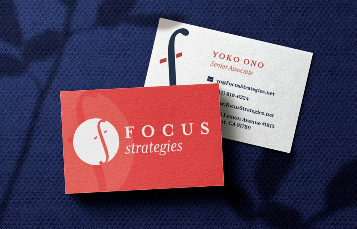
To reposition the organization and maintain a sense of innovation and timelessness, together Uptown Studios and Focus Strategies identified that a new logo was in order. Through in-person meetings and discovery, a new logo emerged with subtle, yet impactful changes, that ultimately left Focus Strategies with a complete and modern brand.
Background
Based in Sacramento, CA, Focus Strategies is dedicated to helping communities improve efforts to end homelessness by using local data to shape program and system design using a “systems thinking” approach. As a data-focused group, it was imperative that they stand out from their competition by appearing as modern and innovative as their work. After meeting with the Focus Strategies team, Uptown Studios identified that a more subtle, small-scale logo refresh was in order.
Discovery
Focus Strategies conducts work that was difficult, even for their own team, to concisely explain. So, the Design Team first spent their time trying to create an easily understandable and repeatable way to relay “who” Focus Strategies was. By examining their industry, the team gathered that Focus Strategies collects and disseminates data around homelessness for nonprofits and other social-support groups that help the homeless. With this understanding, it was easier to begin imagining how Focus Strategies needed to visually position themselves. As a partner and an essential resource to their cohorts, Focus Strategies needed to distinctly emulate their industry while also standing out as a group all on their own.
Design
Using the information gathered from discovery, the Design Team created a “refreshed” logo, meaning a logo that was subtly different from their original. By maintaining the calculator Function “F” symbol, Focus Strategies was able to convey their use of mathematics and data. Tilted on its axis, the “F” also looked like an “S,” cleverly representing the initials of the company. Moving away from the original pink-toned red, a new, brighter and vivid red color took place as the accent. The blue color was chosen because it was the main brand color of Focus Strategies industry partners, allowing them to visually stay within the industry while also setting themselves apart.
Results
- A new, modern logo suite
- Repositioned digital brand
- Easily re-purposed logo across all digital mediums
- New brand style as a base for a website redesign