Project Gallery
Project Overview
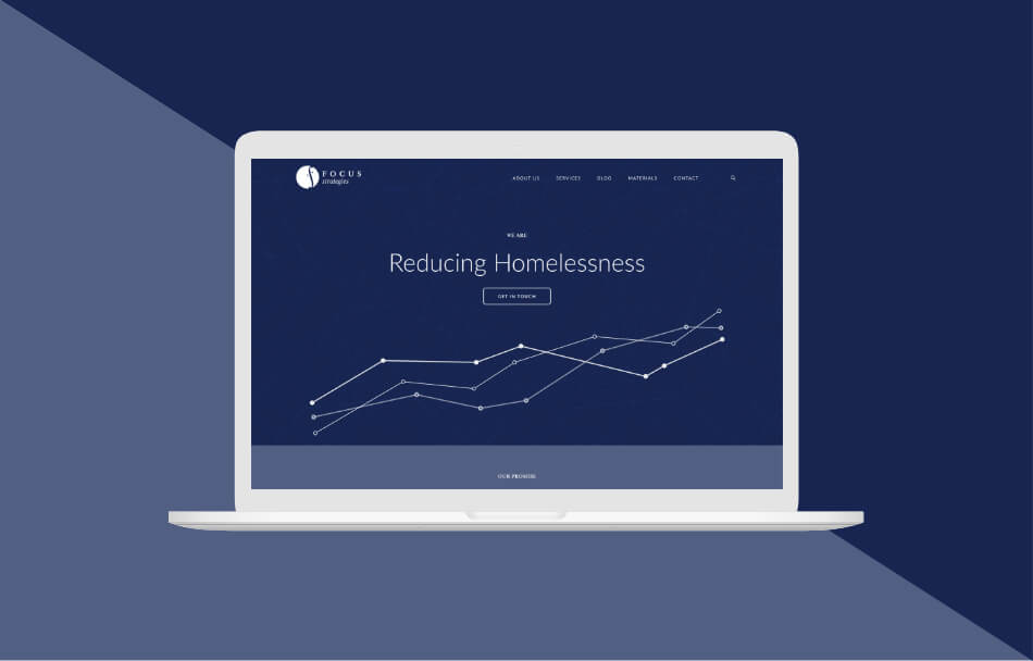
Focus Strategies returned to Uptown Studios looking to bring their brand into the digital age. Despite their hearty amount of content, Focus Strategies wanted to take their refreshed logo and use it to inspire a website that would be easily digestible and functional for their users. To accomplish this, the website would need an entire rebrand including the look and feel, structure, and form. Focus Strategies needed their diverse resources and content to be easily accessible to their viewers all while keeping the experience elegant, friendly, and professional.
Background
Based in Sacramento, CA, Focus Strategies is dedicated to helping communities improve efforts to end homelessness by using local data to shape program and system design using a “systems thinking” approach. As a data-focused group, it was imperative that they stood out from their competition by appearing as modern and innovative as their work.
Discovery
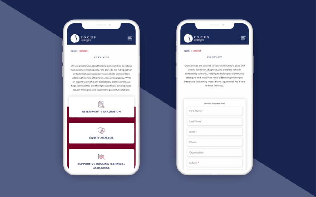
To revitalize their website design, the Uptown Studios Design and Web Teams looked into what was most important for Focus Strategies’ viewers to know and understand. With that information in mind, our designers worked with them to explore creative ways to make the content digestible. By implementing different animations and accordion drop-down sub-animations, the Design and Web Teams were able to separate all of the information in smaller sections. This allowed the user to digest each inch of the site efficiently.
Design
Focus Strategies’ new logo was friendly and sophisticated, so the website took on the same branding. The Design Team knew they had to show the same passion that Focus Strategies exuded through their point of view, without the user feeling like they were reading a bunch of data jargon. Instead, the design we implemented gave it energy and persona. Using data elements as design graphics and large-scale mapping graphics as textures, we were able to bring in “what they do,” “where they are,” and “who they are” through graphic elements and design aspects.
Results
- An energetic, easily digestible web design perfect to translate complex data
- Maintained brand equity through subtle shifts in color and shapes