Project Overview
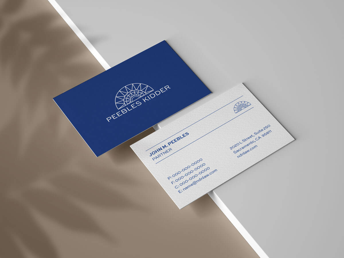
As Peebles Kidder underwent a corporate name change, a refreshed logo was also in order. Since this was a refresh and not a total rebrand, the new logo needed to be simple, easier to reproduce, and modern. Working with a bright color palette, the Uptown Studios Design Team eagerly got to work.
BACKGROUND
Peebles Kidder Bergin & Robinson LLP is dedicated to providing accomplished legal representation in defense of native sovereign rights. Nationwide and on the hill, Peebles Kidder provides effective and innovative counsel in business, government, gaming, finance, natural resources, and tax.
DISCOVERY
Amidst the Peebles Kidder rebrand, the Uptown Studios Marketing Team worked closely with the Design Team creating a seamless connection between the marketing and the design elements. With the understanding that the logo needed to be more modern, the design team was faced with the challenge of keeping Peebles Kidder’s bright color palette ADA compliant. Deciding on blue as the focal point of the mark, the design team concluded their discovery and headed into the design process.
DESIGN
Now that we had the focal point, the designer revamped the original logo by keeping the same natural shapes and feather-like triangles that represent native nations. Clean lines and subtle detail created a modern feel while also giving the logo enough flexibility for easy reproduction on business cards, advertising materials, clothing, and more.
RESULTS
- A modern, timeless logo mark that matches the brands refreshed name
- A bright, easily translatable mark perfect for any potential marketing material