I started working at Uptown Studios in the summer of 2012. One of my first big tasks was the redesign of the Uptown Studios website. I worked over the holiday break from late December into early January and came out the other side with a pretty great looking, new website. We used a template purchased from Theme Forest and customized it to match our brand. It was fun to make and pretty to look at, but it was not without its short comings. Over the years to follow it started to look dated, perform poorly, and was sort of pain to work with on the backend. In the summer-ish of 2014 I began work on updating certain elements of our website to make it easier to work with on the backend, and thus began the epic saga of the Uptown Studios Website Redesign that would not end until the summer of 2016, over 2 years later.
We went through a few designs (and implementations) that ultimately got scraped until we finally settled on what you are looking at today. The goal of our redesign was to create something that would last for years, be easy for anyone on the team to work with, and have a classic look that conveyed the heart and soul of the Uptown Studios team. Performance and accessibility were key components and a lot of time and effort was spent making sure we nailed it on both of those fronts.
Performance
Framework
I knew this site had to be fast. We make websites, so our website had to purr like a kitten when fired up. To achieve this I opted to not use a template from insert-your-favorite-theme-shop-here and instead rolled my own. I started with Foundation 6 and a boiler plate template I found on GitHub called FoundationPress. Foundation 6 is super light weight, has a lot of accessibility features baked right in, and FoundationPress had all the WordPress-y bits built right in as well. So I spun up my WAMP server and git cloned into my local development environment and started hacking away.
Build Process
I decided to use SASS for first time in development of a project and NodeJS server side (with a suite of Gulp tasks) for compiling all of my SASS and JS into one CSS file and one JS file. This helped greatly with cutting down on all of the HTTP requests and sped up page load times dramatically.
HTTP/2
 Once development was complete and the site was live on the server, it was time to secure it via SSL using Let’s Encrypt. This then allowed me to enable the HTTP/2 protocol on the server. From the HTTP/2 website, HTTP/2 is a replacement for how HTTP is expressed on the wire. The focus of the protocol is on performance; specifically, end-user perceived latency, network and server resource usage. One major goal is to allow the use of a single connection from browsers to a Web site. This was also a huge help. Instead of making one request at a time as is the case with HTTP/1.1, the new HTTP/2 protocol allows the server to make multiple requests at once, resulting in fewer requests and faster load times.
SVG
We also made huge use of SVG graphics when ever possible. SGV, or Scalable Vector Graphics, are vector files and function similar to fonts on the web. They can scale infinitely and never lose their resolution, all while staying super small in file size, which was a perfect choice for our website redesign. For example, our logo is 16KB, loads in under 17ms (that’s milliseconds), and has the capability to be blown up to billboard size without losing any of its quality. Anywhere we could, we utilized SVG instead of the more costly PNG’s or high res JPG’s with fallbacks for older browsers.
Plugins
One of the biggest performance hits to a WordPress site are the plugins that inevitably get installed. Plugins can be quite useful for various tasks, but each one usually comes with at least one JS file and one CSS file that get added into the head or footer of your site, creating more HTTP requests and larger page weight. I really needed to keep the page weight down and HTTP requests to a minimum, so I only installed what was absolutely necessary for ease of use on the backend (for myself and the team who may need to make updates) and for functionality I just didn’t have the time or oomph to bake into the template myself. I ended up adding in a bit of my own functionality either in the Customizer, functions.php file, or by making my own small plugins with minimal dependencies.
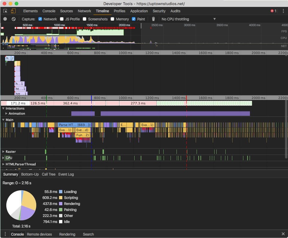
 The Green Line is time to first paint (less than 400ms), the Blue Line is time to interactivity (less than 800ms) and the Red Line is when the site is fully loaded (at 1.5s). Much performance!
Accessibility
The internet is one of the last great frontiers for accessibility, and by and large it has been ignored by most web developers and agencies. Most of the web is inaccessible or at least very difficult for people with disabilities to navigate, so I wanted to make extra sure that our site was as accessible as I could make it. I paid special attention to the following:
- Checked all colors for high contrast visibility for those with low vision disabilities
- Making sure all images (within my control) had appropriate and descriptive ALT tags applied to them
- Making sure the entire site was keyboard navigable without the need to use a mouse
- If a modal window appeared, keyboard focus was automatically moved to the be inside the modal window
- All buttons, input fields, and links were labeled appropriately with either
titletags or an appropriatearia-labeltag - Made sure that the site was minimally functional with JavaScript disabled
- I fired up my screen reader extension on Chrome and listened to the site from top to bottom to make sure it made sense
There is even more that can be done and we will continue to improve our websites accessibility as time permits. Website accessibility isn’t yet required by law, but it soon will be. Not only did we want to get a head start on making our site accessible, its just the right thing to do. The web should be all inclusive, which is just another reason for our website redesign.
Conclusion
Building and launching our new website redesign has been by far my proudest achievement while working here at Uptown Studios.
Our designers put together a truly remarkable design that I feel will last for a long time. We utilized tried-n-true web tech as well as some of the more bleeding edge (yet stable) web tech that will ensure that our website performs well, is accessible to all, and is easily updatable for all members of our team. And the most important part is that it is a site that is truly representative of the talent that we all bring to every project we work on for our clients.
Blog


