
I have been a web developer at Uptown Studios for nearly 5 years, and dabbling in the dark arts of web development since the mid 90s. But as a kid and young adult I was also very artistic. I loved to draw, mostly comic book and Dragon Ball Z characters, and coloring them in with my suite of Prisma Colors at my drafting table was my idea of a good time. Now, as a full time Web Developer I find that my artistic background as a young person has helped me immensely when turning our designers’ static PSD files into pixel-perfect websites for our clients. It has also given me a pretty decent eye (IMO) for good design and identifying good and bad user experiences.
In a profession where your Left Brain usually dominates over your Right Brain I have found that, more and more, my creative Right Brain tendencies from my childhood are slowly slipping away. To combat this, I like to stay on top of the current design trends happening around the web. Here are my top three favorite web design trends to come out of 2016 and the first half of 2017.
Lots of White Space
It is 2017. Not 1992. Screens are large, and screen are small, 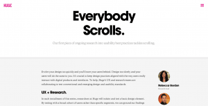 with literally hundreds of sizes in between. Computer screens at the dawn of the internet were 800px wide by 600px tall and connection speeds were around 56k per second. That meant that getting your most relevant content loaded at the top of the page of the utmost importance. Websites were compact, narrow, and looooooong. Skip ahead to 2017 and we no longer have to adhere to the idea of the imaginary above the fold line. This is mostly because everybody scrolls, but also because our computer screens are so damn big these days. We can afford to space things out. This improves the user experience by leaving the eye plenty of room to navigate around elements on the page. But what about small screens, like cell phones and small tablets? White space is equally important on these types of devices because we all have fat pudgy sausage fingers. In the words of Offspring’s Dexter Holland, you gotta keep [those UI elements] separated. Err, or something like that.
Asymmetry
Ever since the inception of Responsive Web Design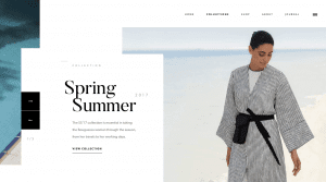 back in 2010, websites adopting the new RWD design trend were usually built on either a 10 column or 12 column grid. This meant that everything was in it proper place and things were almost always symmetrical. That’s all changing now since 2016 and on into 2017. Websites are still built on a grid, more or less, but designers and developers are finding new and creative ways to break out of the rigid grid system offering up more and more dynamic layouts that are not only fully responsive, but also really fun and cool websites. Check out this site for an excellent example of asymmetry in web design. Oooh, but also look at this one.
Rich Typography
Type on the web has long been lagging behind its print counterpart. Designers since the beginning of web development have been handcuffed when it comes to typography. You just couldn’t do on a website what you could do with type in a print piece. This was largely due to the restrictions in place with HTML4 and below, but also due to the fact most people don’t have a massive suite of fonts that most designers have at their disposal. In order for the end-user to see your fancy script font you chose to use in your web design, they have to also have that exact same font on their computer. Now, with services such as Google Fonts and Typekit from Adobe, you can now embed fonts into your website that are served from the lightening quick servers at Google and Adobe. If you want to use a loopy scripty font in your home page design, you no longer have to worry, as a designer/developer, whether or not your website visitors are going to see the font you chose in all its glory. This has opened doors for designers and developers alike to do some pretty amazing stuff with typography that wasn’t possible a few years ago.
Web design and development has changed so much and is continuing to evolve. I can’t wait to see what designers and developers will come up with during the last half of 2017 and into 2018. It’s an exciting time to be in the industry of making websites.
Blog