The Color Factor
Accessible digital color is a huge factor affecting how we interpret the world around us, and it’s especially true for websites and digital products here at Uptown Studios. As designers, color helps us make decisions and understand the meaning of the content. Ever since we were young, we have been trained to stop at things in red, read the black text before grey, and click on links in blue–it has become second nature to us. Creating pieces that properly queue the user with color, is the challenge. Particularly when you want to make sure that every person, regardless of their ability to see, read, hear, or interact with your design is able to actually read the text on the page.
Color Range
As designers, it is our duty to design responsibly. One way we can be inclusive is by selecting colors that make our designs accessible to everyone. At a very basic level, we need to choose colors that everyone can see–especially colors used for text. But how can you tell if the colors you’ve selected work for everyone? The answer is in the contrast. When there is enough of a difference between the foreground and the background colors of two elements, then people can see it–and therefore they can understand its meaning.
Web Content Accessibility Guidelines
In order for designers and developers to be successful when designing accessible digital color experiences, they have to understand the parameters. The Web Content Accessibility Guidelines (WCAG) developed by the W3C, provide a formula to calculate the amount of contrast between two colors, which then results in a contrast ratio.
Contrast Ratios
Contrast ratios range from 1:1 (white text on a white background) to 21:1 (black text on a white background). There are quite a few online tools that make it easy for designers to calculate contrast ratios–a personal favorite being Tanaguru because you can select the minimum accessibility ratio that you want to be considered; if your colors do not pass, they provide you with a few that do.
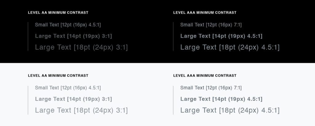
The WCAG also define exactly how much contrast must exist in order for the text to be readable:
Large text is defined as:
- Not bold and 18pt (24px) or larger, or
- Bold and 14pt (~19px) or larger
- Otherwise it’s small text
 The W3C defines a point as 1/72th of an inch and a pixel as 1/96th of an inch, so to convert pixels to points, multiply the pixel value by 0.75.[/caption]
Taking the steps towards designing with ADA compliance in mind isn’t hard–it just takes a little extra effort. While some designers shy away from taking the time to check their color palettes from compliance, we like to think of this extra effort spent as our design challenge. Are you curious if your website is ADA compliant? Hollar at us and we’ll see!
Blog