What is copywriting?
Copywriting is writing the words for an ad. Seems simple enough, right? However, when people ask me what I do for a living and I say, “I’m a copywriter!” They think I mean I’m responsible for creating this symbol: ©
Not quite.
In short: I’m responsible for the words, folks. Like all of them, anywhere, for any reason.
The term copywriting comes from traditional marketing lingo. In an ad, the actual image part of the ad was called the “creative” and the words of the image were called the “copy.” The earliest citation for “copywriter” (originally “copy-writer”) is from a 1911 work about advertising and publicity that describes copywriters as “professional writers of advertisements.” There are many fantastic articles written about what copywriters do and the importance of this position within marketing and advertising, but something I don’t often see is discussions on how exactly this position fits into the wider organization of a marketing/design agency.
Related: Improving UX Using Information Architecture
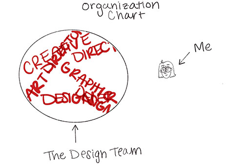
Over the past three years while working at Uptown Studios, I’ve had the privilege of figuring out how my role fits into our existing team organization. (See org-chart below) With the time I’ve had to hammer things out, I think I’ve finally narrowed it down to five different methods that you and yours could easily apply, or simply, observe.
 It Starts with a Creative Brief
Not for me, silly! For the designers. Some agencies work exclusively through the method of creative briefs. However, at Uptown Studios, only the designers receive creative briefs on a regular basis. A creative brief is basically an instruction sheet that filled out by an Art Director or Creative Director. Using Creative Briefs can sometimes be challenging because it’s all up to how the designer/copywriter interprets the objectives. This is where skill, experience, and expertise come into play: the more experience you have, the easier it is to trust your best judgment and come up with creative/copy that you believe fulfills the requirements listed in the Creative Brief.
Now, the chicken or the egg?
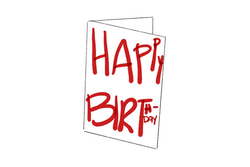
Have you ever heard the old adage, “What came first? The chicken or the egg?” It is usually said when you’re stuck, trying to figure out the order of operations to complete a task. When it comes to designing, I often find myself thinking: “What should we do first? Come up with the design or the copy?” The two elements are supposed to inform each other. It’s usually pretty obvious when one has been done without thinking of the other. To illustrate this quandary, the best example I can think of are handmade birthday cards.
Have you ever received one of these?
 Thought so.
The problem here is that someone didn’t think through how the design of their card would be affected by the length of the words. It’s so easy to do this! You get excited, raring to go with all of your design ideas, that you forget how the words will impact the design. But also, sometimes it’s impossible to design anything without knowing how many words you will need! BUT! What if you need to know the design to know how many words you have to play with? What comes first?? I call this the Chicken/Egg Problem.
Figuring out how to adapt and create within the Chicken/Egg Problem has drastically improved my ability to do my job, create connections with my team, and produce epic results. I’ve identified about five different solution “methods” to the Chicken/Egg Problem that any copywriter could pull from to achieve a better workflow. Obviously these are Uptown Studios’-specific methods, but I think you’ll be surprised to see how much you could apply to your own team dynamics. Ready to get into it?
Egg Method: Design First
In the Egg Method, the design of the deliverable is completed first. This is not a bad thing, it just presents its own unique set of challenges. Depending on the kind of deliverable, I usually take a different approach to the words, but with one core similarly: word counts. For example, between creating the copy for a brochure versus a web page, I will usually examine the design files. From experience, I know that some designers will add filler text to create wireframes and page mockups. They usually do this using “lorem ipsum” or just Latin filler text.
When this happens, I will use the Word Count tool to figure out exactly how many words they envisioned fitting in that space. Then, when it comes to creating the actual copy, I do my best to stay as close to that word count as possible. Sometimes this can be a challenge, especially if the information that needs to be there simply won’t fit. If that happens, I have to get creative. Can I place that information in a different spot? Find an even more concise, yet on-brand, way to get the same point across? Or, could I ask the designer to shrink an image size or font? I don’t want to interfere with their design processes, but sometimes, a simple ask makes the end result SO much better. And, by asking instead of just insisting, I build trust between myself and the designers.
Chicken Method: Copy First
Obviously, I want to go first ????♀️ However, like all of these “methods,” this can present some challenges. While not having to stay constrained to predefined word counts is nice, it can be even harder to have to figure out how to present information to the user without the road map of a pre-designed file. Graphic Designers usually have a strong user-interface (UX/UI) background. This means that they are trained in figuring out the best way to present information regardless of the medium or the goal of the deliverable. I, however, did not have UX/UI knowledge when I took this role. I knew how to structure a narrative, sure! But creating copy for things like web content or “interactable” mediums—essentially anything where the user can skip between sections, making their own “order” of how they read—was hard to do without some foundation knowledge.
In Need Of Content Creation? We Have A Team Of Marketing Professionals That Will Take Your Business To The Next Level.
To help improve my own ability to order information, I began to do lots of research into Information Architecture. This wildly improved my understanding of basic design principles as well as allowed me to better identify steps I could take to anticipate the choices a designer might make. So now when I begin a project, I think to myself: what is the medium? How many non-word elements will also likely be included in each space? I will look up examples of completed designs. How many words actually fit best in a space? What does a designer typically like to do for this? From there, I am able to create copy that a designer can easily utilize (and not feel equally constrained as I do in the Egg Method) when they go to create. Voilà!
Horse Method: Client Supplies Copy
When the client is responsible for the words and I am simply acting as an in-between, I have to tread very carefully. Of course, I want to tread very carefully. Not only has the client not paid for me to begin working my ~magic~ but also, they probably are happy with the content they sent over and aren’t looking for anything to drastically change. During this method, I do my best to get a strong understanding of the client’s expectations. Are they okay with me adding small things like H1 or H2? Often, they only want that very sparingly. I only ensure that there are no grammar mistakes and that there is no missing information. While this might be hard for designers since they cannot remove any information, at least I can rest easy knowing that the copy is the best it’s going to be.
Cart Method: Design First, Then Client Copy
This is probably my least favorite method. However, it is probably one that I deal with the most in regards to things like annual reports, publications, brochures, and information guides. Usually in long form, my role is to proofread for grammar/spelling mistakes, formatting consistency (like all section headings are bolded and chapter headings aren’t indented), and to also help the designers find the best flow of information. Since I will have actually read all of the content in its entirety, I can act as a situation subject matter expert. They might ask me if a certain section would still make sense in a new spot or if changing the hierarchy of headings will distract the reader. Often the most laborious method, I usually learn the most interesting information when working on these projects. It is impossible to read through an entire 60,000 word annual report and not retain some of that information!
HorseCartEggChicken Method: All Together Now
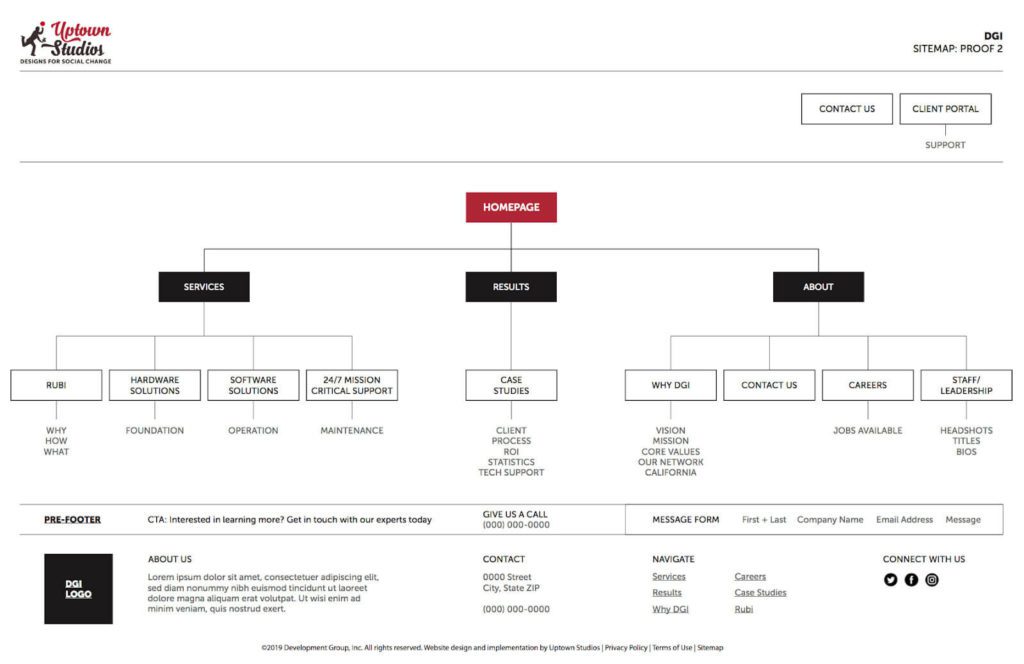
Congratulations if you’re still with me! This is the last one. The most collaborative (and the most fun!) method, HorseCartEggChicken combines all of the above into one. I usually only work like this when creating things like web content or if we are working on a large-scale rebrand. When working so collaboratively with all the members of the design team, I have an opportunity to find new and creative ways to implement and create what I call “design copy.” Design copy is no different than normal copy, it is just made with a clear emphasis on the fact that I am creating words in tandem with the design of the deliverable. My favorite result of doing this method was creating a secondary step to the traditional sitemap (see below).
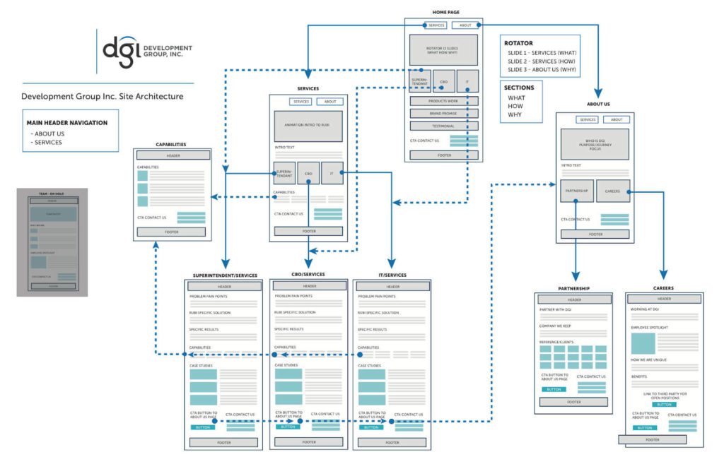
 After creating the sitemap, the designers and I met to figure out precisely what information would go to each page. This allowed us to have an in-depth discussion on site functionality, user flow, and branding. Did the brand want to carry over their cinematic photographic style to the way that words were presented on the page? How could we do that? Enter the site architecture. (See below).
 Using this flow, I was able to sit with the designer while they figured out the basic structure of their design. We discussed our combined vision for the site: did we want minimal text that was impactful? Rotators? Hover effects? What were the client’s expressed goals and “must-haves?”
After every step in the design process, I would meet with the team again to discuss how we should pivot. The end result was a web design that was not only visually appealing, but also an entire package. We designed how the user might experience the site if they only read it, or if using screen readers, simply heard it. All elements added to the overall design. It was so satisfying to see it come together! Check out the final website here.
In short
Working within the design team is a continuous process. Every day I learn new, more efficient, better ways to integrate myself with their creative processes. Every agency is different—it all depends on the people you have on your team as well as your willingness to learn. I hope that some of the approaches and resources I listed above helped you get a better idea of how easy (and adaptable!) someone in my role can find their daily work to be. Any other questions? Email me at Lizzie@uptownstudios.net
Blog


