
 I know its a tad late, but Happy New Year! Last year was pretty great, amirite? Good times, good times. But 2013 was not without its shortcomings, especially in the world of web design. And the times they are a-changing. So without further ado, here are my Top 5 most anticipated (and some already happening) trends in web design for the year 2014 and beyond.
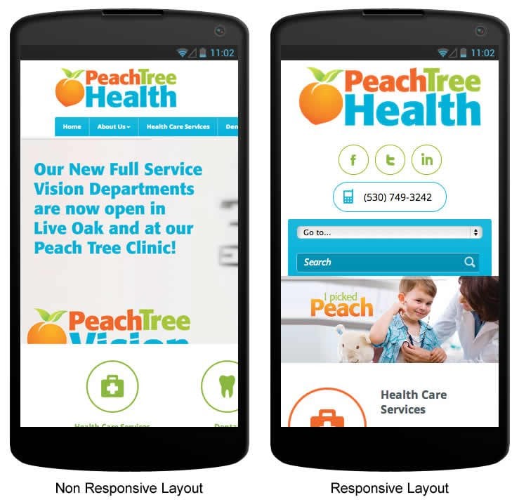
1. Responsive Web Design
Now this one is a no-brainier, as in you’d have to have ‘no brain’ to not see the importance of responsive web design. Responsive Web Design, or RWD, is the practice of creating one website design that ‘responds’ to all screen sizes. By using percentages instead of fixed pixel dimensions and by adding special media query break points to the code of a website, it will serve up the same content to various devices and optimize it for viewing regardless of size screen. It is device agnostic and potentially future proof. It is fast becoming a household term which is quickly making ‘m.’ websites a thing of the past.
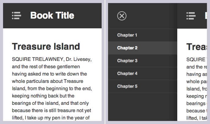
2. Off Canvas/Select Navigation
This prediction owes a lot to Responsive Web Design and to mobile smartphones in general. This trend prediction relies heavily on the fact that nearly 20% of all web traffic is via a smartphone or tablet. That’s means 1 in 5 people are visiting your website via their iPhone or Android Tablet.
Off Canvas/Select Navigation basically means all of the navigation for you site resides either in a ‘form-style’ select menu or in an ‘off canvas’ toggle menu. The idea is that screen real state is limited and traditional drop down menus take up far too much space. Expect to see more off canvas style menus, accompanied by their ‘hamburger button‘ counterparts much more frequently in 2014 and beyond.
3. Magazine Style Layouts on the Web via Regions, Exclusions and Blend Modes
These are exciting times we live in. Long has the print world had the luxury of laying out their type and graphics in unlimited and interesting ways. But the tyranny and bullshit has gone on long enough! Someday soon web design will be similarly unhindered. Behold! Regions, exclusions, and blend modes are nearly upon us! Through the use of regions and exclusions web design will finally be able to flow type around and inside of unique shapes and columns. Blend modes will give designers the opportunity to bring Photoshop into the browser by granting the ability to blend layers with modes such as Multiply, Screen, Overlay, and so much more. Keep your eyes peeled for total awesomeness coming to a browser near you.
4. Flat Design
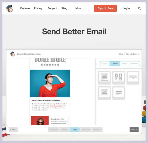
Flat design involves getting rid of 3D graphics and gradients in favor of flat, even tones and a minimalistic layout. Now this is nothing new and certainly you’ve encountered it before now, but flat design is blazing ahead full tilt like it never has before. Google and Android have long since championed the flat look and with Apple’s iOS 7 release in late 2013 they too have shaken off the shackled of skeumorphism for the flatter look. The web design world is close on the heels of these tech giants. DropBox, MailChimp, and FitBit are just a few examples who have embraced the future. Expect to see all your favorite websites following suit if they have not already.
5. Non Web-Safe Fonts
Another great envy of print design, custom fonts are among the most potentially appealing aspects of CSS3 for web designers. Web design usually has to keep to a small sample of ‘web-safe’ fonts because whatever font a designer uses also has to be widely available on the end users computer or device. In the past if a designer wanted to use a wild and crazy fonts they were generally SOL unless the viewer had said font installed on their machine. But soon this will be NO MORE!
While the @font-face property has been around since CSS2 (it’s even supported in IE5!) it’s not a very widely used technique to implement non web-safe fonts. You see, it requires an actual .OTF or .TTF font be uploaded to the server and subsequently downloaded by the end user’s browser when they view your website, which can slow down page load times and be a general bummer all around. Also this technique is only available for open sourced fonts and is not supported in all browsers.
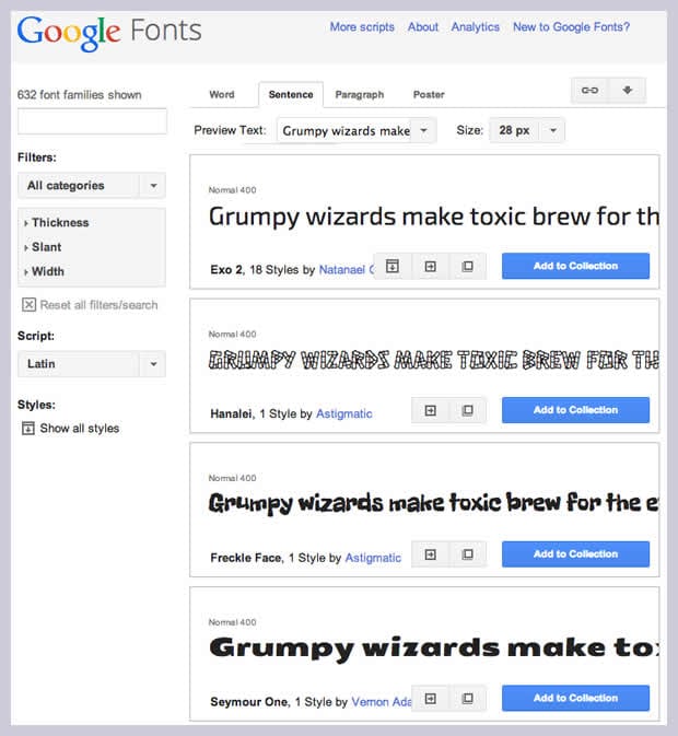
There are, however, other alternatives out there with far better results. Google Fonts or Adobe TypeKit are prime candidates, both of which offer up hundreds of fonts for use in web design. While Google Fonts is a free service, it is limited only to free fonts. TypeKit has a much more robust selection but it requires a subscription to the Adobe Cloud. In either case, all that is required is a small snippet of JavaScript to be added to your site’s header in conjunction with a small amount of CSS and you’re cruising to Custom Font City in no time. Best of all it’s supported in all of the major browsers including IE7 and IE8. So expect to see lots more non web-safe fonts on the web in the coming days and years.
So there you have it. Exciting times await us just around the corner. But unless you’re using an up-to-date modern browser you’ll get left behind quick. Now do us all a favor and upgrade that dusty old browser of yours!
Blog