You guys, it is so expensive to take a site that does not meet ADA Compliance (WCAG 2.1 AA compliance) and bring it up to code. And it is so boring. I really don’t like doing it. So, I want to help you out, and also help me out, by giving you some tips on writing the content for your website.
1. Don’t use plain old bold text or underlines as headings
(Use a Semantic Hierarchy)
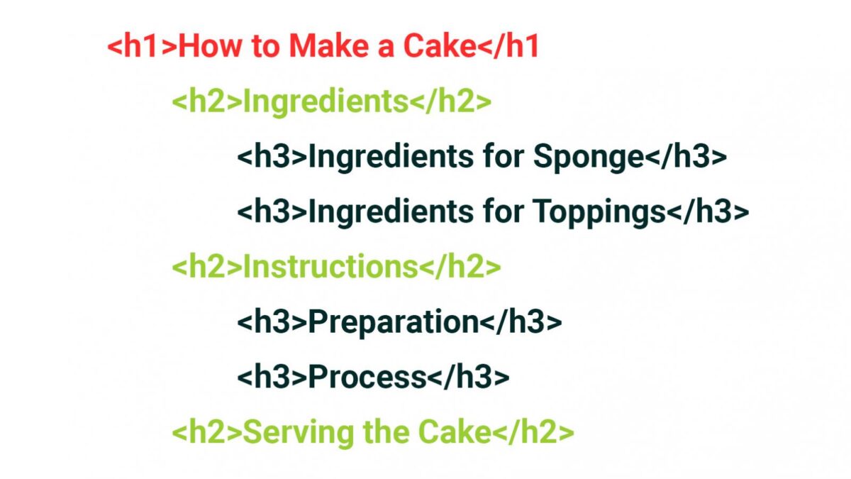
Fonts are hard. Choosing the right size heading for the right purpose can be even harder. What you should not do is only use plain old bold text or underlines to indicate paragraph or section headings. What you should do is use actual heading tags (H1 – H6) and use them in a semantic way.

But what you did do was not that and now your page has no semantic hierarchy and people using screen readers can’t easily skip from heading to heading to find things that interest them and now they have to listen to it all! Smooth move bonehead!
2. Don’t use colors that are hard to see
(Fonts and input fields should have a 4.5:1 minimum contrast ratio)

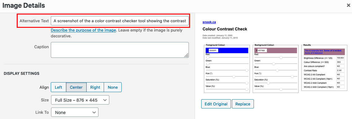
Sometimes people like to get a little fancy with the color choices they can apply to text inside of a page or post. And some people should have their editor privileges taken away. All color combinations should pass a color contrast check. The contrast ratio to be WCAG 2.1 compliant is 4.5:1 for ADA compliance. Check that your color combination will pass an ADA contrast inspection before using them. Color is fun, (yay color) but use colors that everyone can actually see. That vibrate, electric blue isn’t working too great on that desert mauve, Jill. Now no one can see when the company picnic will start. Pretty boneheaded, Jill.
In need of ADA compliant design? We have a team that will make your website ADA compliant.
3. Don’t hide your links. Make ’em look like links! Use the same treatment throughout.
And don’t make things that aren’t links look like links!
Links are what drive the internet. Without links, how would we get around a website? We’d have to know the exact URL for every page we want to visit. By heart! Wow, what a time saver links are. But, what does a link look like you ask? Well, it stands out from the rest of the copy as truly different, usually has an underline, or is bold, or has a right-arrow-quote (or ») and will have an obvious color change upon mouse hover or focus. You get bonus points for having all four! The only place you should be using an underline is for a link, not for the super-duper important thing you wanted to highlight in Todd from Accounting’s blog post. See how that’s not a link? Super annoying right? If it looks like a link it should be a link. Don’t be a bonehead like Todd.
4. Don’t be super lazy and not ALT tag your images. Come on!

We can’t all see. If you are one of those who can see with your eyes, and see well, then you’re very used to browsing web pages full of vibrant, colorful images and I’ll bet you love it. But, for individuals who can’t see, they also can’t see those images. Non-sighted or low vision individuals are most likely using assistive technology to navigate your site, like a screen reader. What a screen reader does is it, wait for it, reads the screen. From top to bottom. All of it. And when it comes to an image, which if you remember the person still can’t see, the screen reader is going to do one of two things: read the ALT tag if one is provided, or let the person know there is an image and then skip right over it with no detail whatsoever. They don’t get a very fun experience in that second scenario, do they? So what we should all be doing is tagging each and every image we upload to our websites with an ALT tag. The contents of the ALT tag should be a literal description of the image. If the image is of two people in business attire sitting across a desk from one another in an office while shaking hands and smiling, then you should write in the ALT tag an image of two people in business attire sitting across a desk from one another in an office while shaking hands and smiling. So easy even a bonehead could do it!
5. Don’t not make the site keyboard navigable
(Meaning, make your website keyboard accessible)
Most of us can easily use a computer mouse or trackpad when traversing the web. But its not all about you, Geoff! A person with a physical disability coming to your website may only be able to use a keyboard. Can you get around your website using only the keyboard? If not, then no one else can either! That’s a pretty bonehead mo— actually this last one is a pretty difficult one to do as a non-developer, so you get a pass on this one. Sorry, Geoff. But hey, that’s what we’re here for!
So there you have it. The top 5 things you can do to make my— I mean your life easier. I don’t want to have to fix your non-ADA compliant site, but I will, I guess. And now, some closing remarks…
Recently there has been some hubbub on the internet regarding ADA compliance for websites and beyond. I don’t have the specifics, but some famous people have been sued pretty hard. Basically, if you have a business that sells products at physical locations, and if you also sell those same products online, then your site should be required to be as ADA compliant as a physical store already is required to be. Wow that sentence was a mess. But you probably get what I mean. Private citizens sued people like Kylie Jenner and Pharrell Williams over things like that, and they will probably win! Look it up! That’s just one reason to make your site ADA compliant because its not just celebrity-owned businesses who are vulnerable to this kind of lawsuit. You can also lose potential clients or employees if they can’t navigate your site. That’s another one right there. But really the only reason for making your site ADA compliant that truly matters is because it is right. And decent. And that’s what we should all strive to be. Most importantly, you have to! Someday anyway. Soon it will be a requirement of all websites to be at least WCAG 2.1 AA compliant. I don’t know when, because there doesn’t seem to be a consensus on the actual deadline, but rest assured this will someday be a requirement for all websites. So hop to it, boneheads! Or have us do it, and in that case, UGH!
Blog


