Start with Selecting your Greys from Dark to Light
A good starting place to build an accessible digital color palette is to determine the shades of grey or neutrals for your palette. Select grey values that look different enough from one another to suggest primary, secondary, or tertiary status–and also pass accessibility guidelines. Additionally, you may want to consider using some hue in your greys to cool them down or warm them up. By doing this, greys will appear more natural when you move into the lighter variants of grey.
To begin the process, start by selecting your darkest value of grey; this will be considered your Grey 100. You can choose to use rich black as your starting point, however, the harsh contrast of black text on a white background (especially on screens) decreases the readability and the letterforms vibrate. Your designs may benefit from using a color slightly less than 100% black for better user experience. Check the contrast ratio of your Grey 100 and ensure it has at least a 7:1 contrast ratio.
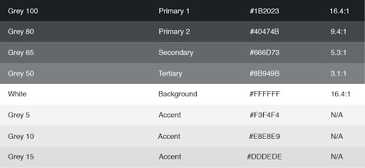
In the example above, Grey 100 is more than double the 7:1 ratio so when designing for websites that have AAA requirements, the Grey 100 value is dark enough that the next grey variant is noticeably lighter, yet still passes the AAA text requirements. In this case, Grey 80 passes the 7:1 contrast ratio requirement and still has enough contrast from Grey 100 to support the visual hierarchy.
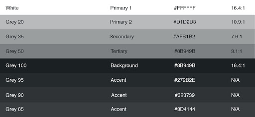
Once you know what your contrast ratio is for Grey 100, you can start calculating your lighter variants and checking their contrast ratios. If your site design will have areas with a black background, repeat the process in reverse for the greys that appear on a black background.
Finally, select grey values for backgrounds, borders, etc. even though these grey values cannot be used for text. In the graphic above you can see the palette includes 5, 10, and 15 percent grey values that can be used as design elements and do not need to conform to the W3C accessibility guidelines. Note: it is recommended to use solid colors and not percentages of black.
Selecting Colors
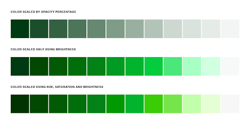
This part of the building an accessible digital color palette is similar to selecting your grey values, but I can’t lie, it’s a little more challenging. It’s easy to draw-down percentages of a grey value because you only need to manipulate the level of brightness. However, when color is reduced in opacity, the spectrum of color becomes desaturated and lack-luster.
To create richer draw-downs of color, use the HSB color space to adjust saturation and brightness values while maintaining the same hue. At the extreme ends of each color spectrum, you may need to slightly adjust the hue as well to get the perfect color you’re looking for. Colorbox is an online tool, created by Lyft, that helps designers easily generate rich draw-downs of color that can be exported directly into code–which is pretty nice I must add.
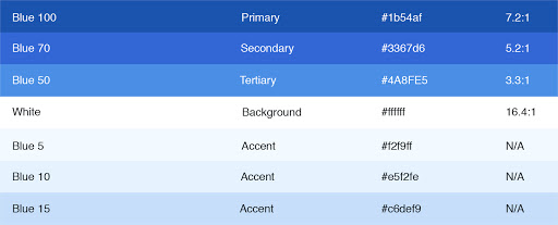
The purpose of selecting a full range of color is to help make early decisions about the accessibility of each shade so you know how you can and cannot use each color. Most sites have a similar structure in the way color is expressed; there’s a primary color or brand color, surface and background colors, and UI colors for success states, warnings, errors, etc. Use your color draw-down to define which shades will be used for primary, secondary, and tertiary text uses as well as any shades for accents, backgrounds, strokes, etc.
Repeat this process for every color in your palette. Once you’re finished, you will have a full-color system that meets accessibility requirements and has the versatility to meet all of your UI needs. Interested in achieving an ADA color palette on your new website? Hollar at us!
Blog