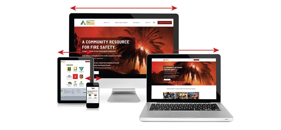
What’s Responsive Web Design and Why You Need It
The world of the web is becoming increasingly dominated by mobile devices of varying screen sizes. The amount of people relying on their cell phone or tablet for their primary point of access to the web is getting larger and larger each day. In the past this has presented a problem (read: nightmare) for web developers and designers alike. Then along came A List Apart – Responsive Web Design, who parted the vast and treacherous waters of the mobile web to make way to a new and bright future in the promised land of ‘Responsive Web Design.’
Responsive web design is by far my favorite new trend in web development/design. In the past, if a developer wanted to make a website mobile-friendly, it required writing an entirely new site just for mobile devices. Even then you could never guarantee how it would look because no one mobile device screen size and resolution is alike. A developer could easily end up having to write upwards of 10 to 15, to 50 different HTML/CSS documents to ensure a site displayed correctly on all devices. Kill me now, please. But with responsive design you write one HTML document and one CSS document and the site will then ‘respond’ to a person’s screen resolution and scale the site accordingly. Place in a few @media queries here and there at specific break points in the design, and voila! – responsive web design.
The way it works is that it relies on the relative measurements of ’em’ and percentages instead of fixed pixel widths. When the screen size gets below a certain width, a simple CSS rule is added to shift the contents of the site around to better display on smaller devices. This is a major oversimplification and not at all as easy as it sounds, but it is gigantic leaps and bounds easier than writing *gulp* 50 more (or even just one more) documents for all devices.
However, there are some drawbacks to using responsive design. Making things responsive requires using one set of images and graphics, and those images and graphics need to be uploaded at their largest potentially viewed size in order to scale up and down without distorting. Meaning that large graphics and images will need to be downloaded each time a person visits your site for the first time. But with the ever increasing bandwidth becoming available on mobile networks, this ‘problem’ will cease to be a problem at all in the near future. But keep in mind that not all sites need to have a responsive layout. Take Craigslist for example.
One great example of a responsive web site is The Boston Globe. It is one of the largest responsive projects out there being that its a news website. So take a look and marvel at the awe-inspiring spectacularness of this totally awesome responsive website and then get to work converting your own site, or contact us and we’ll take care of it for you!
Tina’s Two Bits:
5 Tips for Driving People To Your Website
You have created a great looking website NOW how do you drive people to your website? What makes them want to see what you are about?
1. Write articles and get them published or publish them on your blog (set up a blog if you do not have one).
2. Join forums and online communities – get involved and share information about what you do and how good you are at that job.
3. Generate more clicks to your site with the use of Google Adwords – there is a cost involved, but it may be worth the investment and visits to your site may jump significantly.
4. Find other websites that invite people to share content. Leave a comment on the Sacramento Bee article that is about what your business does, position your business as the leader.
5. Use strong keywords and keyword content that is plain and pure about what service you provide. Content is King, so spend some time on your web content and make it rich.