Many business owners feel that they are too small to worry about branding, don’t understand why branding matters, or think they don’t have the time or money to invest in it.


Even if you are the president of a home business and your cat is your VP, you are not too small to make branding a part of your daily business.
First off, let’s define brand. Your brand isn’t just your logo and your website. Your brand includes your logo, website, and marketing collateral. But more than that, it is the public’s perception of you, your company, your product and/or your service. It is the culmination of every experience your audience has in relation to your business. This is why branding matters to your business and how your audience understands your brand’s mission.
The purpose of good branding is to set you apart from your competition and make your business memorable.
Here are three areas to focus on to get you on the right brand track for understanding why branding matters:
1. Consistent look and feel:
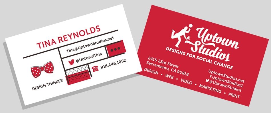
Your logo, your colors and even your typeface should be uniform across your website and all marketing materials. If you are using Arial on your website, then it should be on your business card and brochure too. When Uptown Studios designs a logo for a client, we include the creation of a style guide detailing your fonts, colors and layout guidelines to help keep you on track.
2. How your brand communicates:
Whether it is through a brochure, social media, your content on your website or how your company interacts with its audience, develop a constant voice. Whether you have one person or twenty people tweeting from the same Twitter account, it should sound like the same person who is posting on Facebook and welcoming each new client. Be uniform in all communications. Uptown Studios provides social media management, which includes research, copywriting and distribution of content.
3. Product/service differentiation:
It’s not often that you will find yourself selling a product or service that someone else isn’t offering around the corner. Focus on accentuating the differences that place your product or service above the rest. At Uptown Studios, we are a visual communications firm creating Designs for Social Change. It defines who we are as a team and sets us apart from all other visual communications firms.
So whether you’re Apple or Mom’s Apple Pies, tending to your brand is a must and Uptown Studios is here to help.
Tina’s Two Bits:
In our winter days I want to talk about The Color Gray:
Gray is timeless, solid – rock solid, in between and practical in almost any use. Too much is boring and dull, but a little gray can help the reader read faster, create a reliable essence and add to your layout. There are all types of grays too: Warm gray with a little red can perk up the edges of any design and invite you in. Cool gray has blues or greens and can add to a feeling of loss or age or sadness and distance. A phantom gray is 5-10% of black and can give depth to a design. Silver is included in the shades of gray and can be used to show strength and character – just not too much to tarnish your design…